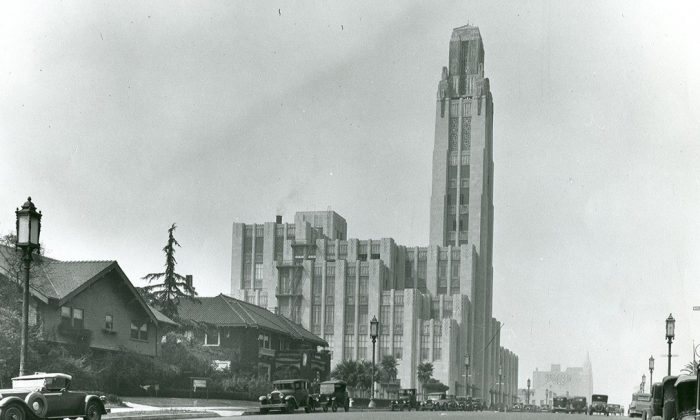
In 2017 my wife and I visited the Bullocks Wilshire building in Los Angeles, California. This magnificent Art Deco building, completed in 1929 was originally a luxury department store but is now owned by the Southwestern Law School.
My wife has many childhood memories of this place. Here families would gawk at the live mannequins in the Louis XVI room, wander through the Perfume Hall and indulge in an afternoon snack in the desert-themed tea room upstairs (which is still there today). For years she has wanted to revisit the building which is possible but only for one day a year and tickets sell out in minutes! That year she managed to grab some and so when the day came we dressed up and arrived at the porte-cochère in the rear of the building.

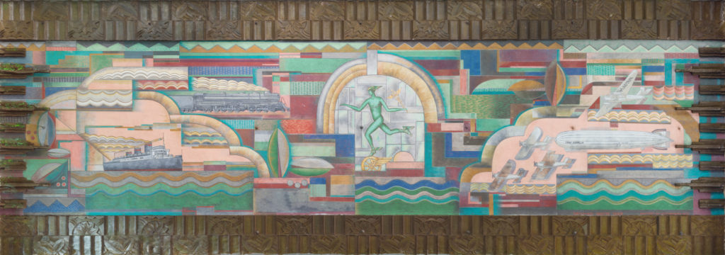
The porte-cochère (or car port) is really what this article is about. On the ceiling exists a fantastic mural created by Herman Sachs called “The Spirit of Transportation”. I wanted to photograph it but it was so long (nearly 70 feet) that it was impossible to a) fit it all in one image using an 24mm lens and b) capture it without any lens distortion. My first thought was to create a panorama image which is tricky enough without a tripod, but it would not eliminate the barrel distortion of the lens.
Instead I decided to use my photogrammetry skills to capture as many images as I could before and after the guided tour and create an orthographic projection later in Agisoft’s Metashape. That would give me full coverage but more importantly also render me a perfectly straight and undistorted image.
However, as things often go in life, it ended up sitting on my hard drive for years. Now that we’re all at home due to the COVID-19 outbreak, I decided to take a crack at it. After color correction I converted all the images to a linear colorspace (to minimize ambient occlusion) and plugged them into Metashape. Et Voilà! Out comes this fantastic rendering of that mural.
Had I known of this mural, or had I had been hired to 3d scan it, I would have brought a chrome and gray ball. It would have allowed me to mitigate the ambient occlusion and other unfavorable lighting effects now baked into the color. I would also have used a circular polarizer to reduce the glare on the wood paneling around the mural.
I have since sent this image to the Southwestern Law School which owns the building for which they were very grateful.


